Before you design and develop your eCommerce website, we encourage you to look at these samples. These websites have successfully generated leads and received commendations from their visitors, not just for their aesthetic value but also for their usability.
If you must know, a good eCommerce site isn’t just about the best product images or the intriguing transition and animation. What matters most is how fluid one could navigate through your pages. So, let’s jump to the best examples.
Best eCommerce Sites
Below are a few eCommerce sites that use the principles of a good website design.
1. Walmart

We are happy with how Walmart is keeping up with the times. They use the best techniques to keep their eCommerce site fast, easy to use, and interesting. Their hero images are captivating, and their products are categorized accordingly. Plus, they highlight their discounts and promos, which encourages people to shop right away.
2. Staples

It’s hard not to spend hours just browsing through Staples’ eCommerce site. What they do is bombard its visitors with ongoing promos, which are hard to resist! They also included a ‘Deals’ menu for those who would like to maximize every dollar. The design is pretty straightforward. Even those who are not familiar with how an eCommerce website works could easily understand it.
3. PowerOnPowerOff

When offering a niche-specific product through eCommerce sites, it must educate the market of what it is and what it does. But if you are going to write a lengthy product description and show it at the onset, it could be an eyesore, and your visitors might leave your website.
One of the best approaches was used by PowerOnPowerOff. From their home page, you will see the product images. You are then given the option if you wish to read further by clicking the Learn More button.
4. Mulberry
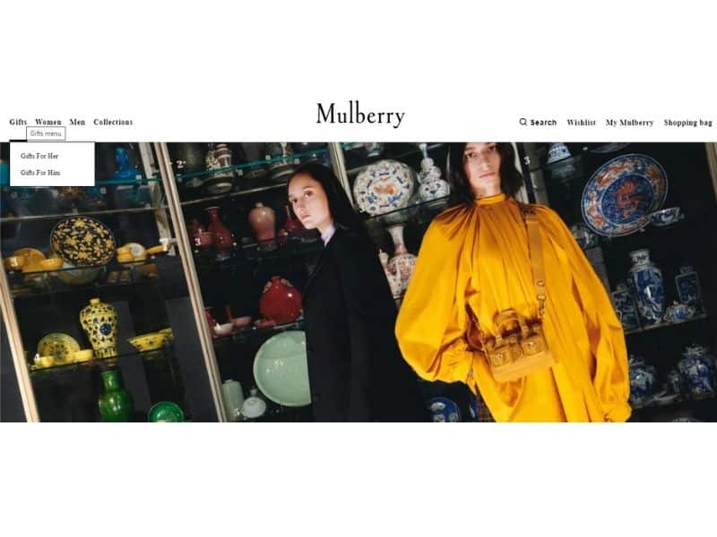
What we appreciate the most about Mulberry’s website is the impeccable organization of its products. If you hover to their Gifts’ menu, it is categorized ‘For Her’ and ‘For Him.’ Now, if you are looking for ideas on what to give your friends or family, this could speed up the entire process.
5. Olive Clothing
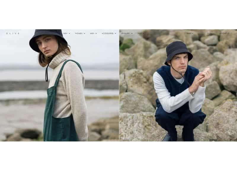
Apart from using the basic techniques in designing eCommerce websites, Olive Clothing highlighted that they are PCI DSS- compliant in their home page. This means that their payment process and gateway are safe and secure. These subtle reminders will give confidence to your visitors to purchase from your website.
6. Skullcandy

Who says you can’t have fun with your eCommerce webpage? Skullcandy remained true to its branding of playful colors and unorthodox design. But that doesn’t mean their website is cluttered. In fact, you can easily find the gadgets you are looking for. You can sort it by Featured Items, Newest Items, and Best Selling, to name a few.
7. Sierra Designs

When you go to Sierra Designs’ collections, you will see that apart from the price of the products, they already added the review stars. This makes it easy to filter which items are good enough.
8. Zwift

If you are in the active lifestyle niche, then you might want to use Zwift’s approach. Instead of using still hero images, they used videos. This simple tactic makes you appreciate their app more as you can already manage your expectations through their visuals.
9. Mahabis
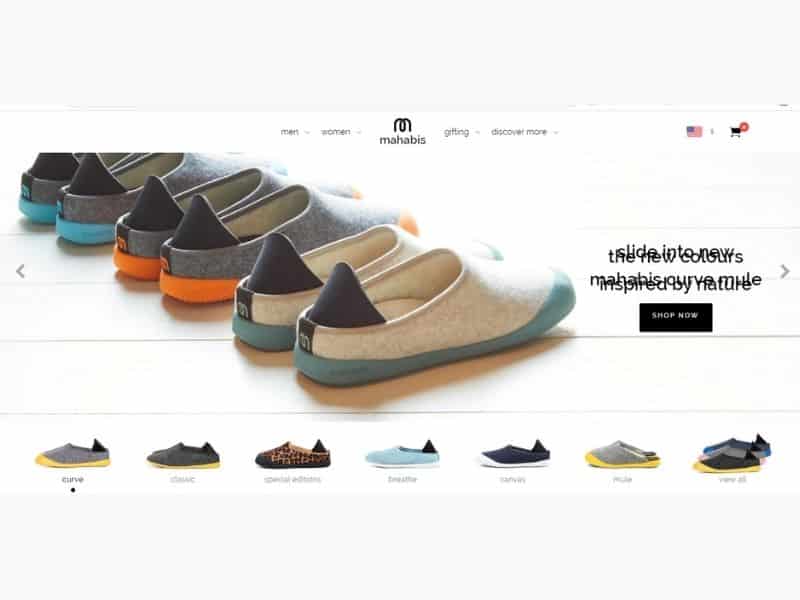
The brand Mahabis is also clever enough to add its USP to its eCommerce site. After all, if you are not familiar with the brand, you will ask why you need to purchase it. As you scroll down the website, there are icons showing that it is made of natural rubber sole, uses soft Italian wool lining and recycled materials. Since most people are cautious about their choices, this should sit well with them.
10. Ratio

Most website designers still don’t realize the importance of a call to action. Again, your visitors need a bit of push and to be directed on what they have to do next. What Ratio did was to place their Shop Now button strategically. In fact, it’s the first thing you will see when you open their website.
11. Oi Polloi

The last to make it in our list is from Oi Polloi. Instead of using videos, they maximized micro-animation, which added character to their website. It’s a good technique, most especially that videos might slow down your website’s speed. And as most of you know, a slow website is a cardinal sin in the universe of eCommerce.
When you are developing eCommerce sites, it is a must that you work with professionals. It’s easy to design a visually appealing web page. Throw in some colors, use the best images, choose the right layout, and you are good to go.
But the case is different if you are using your website to drive sales. The design doesn’t heavily rely on beauty alone, but it should prioritize functionality.